Alphabet
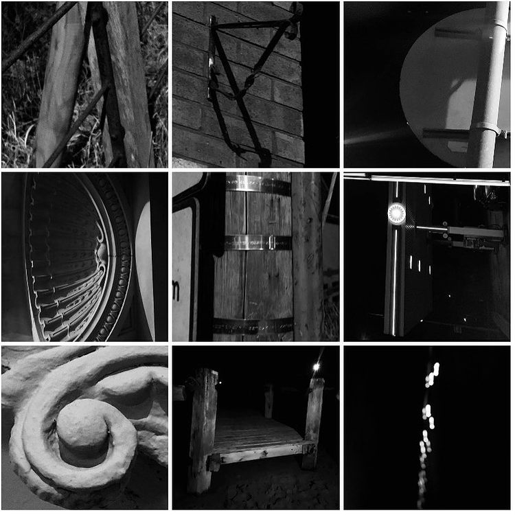
Made from images taken from around Pwllheli. Could not find anything that looked like a Q, to make up for it I got an image of a question mark and quotation marks. Edited the images to be in black and white.
Went out at night even though you cant see as much. The visual restriction and the deep shadows casted by streetlights allowed in theory for stronger contrasts and therefore stronger photography in black and white.
Analysis:
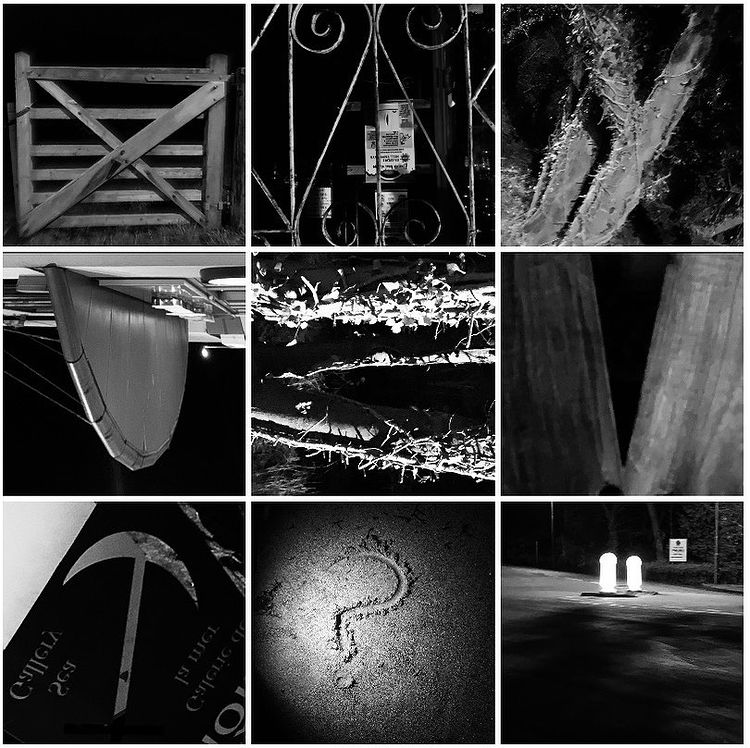
I think They turned out quite well for the most part. They're definitely interesting and a bit gimmicky. If I had to pull some lesson away from this it would be what type of objects look the best in my opinion as letters. I prefer the metal bars, the curves in architecture, a broken fence, some distant lights. Those work well. moody, dark, hazy, alone quiet and desolate. something very liminal. The ones to do with obviously assorted ones such as the sea weed in the R, the question mark and ones which are more commercialistic such as the T in the anchor of a sign. Those miss the feeling. They feel made for the purpose f the image instead of discovered, or like something that was meant to be found and looked at in that way. compare that to the arch in the D. it being flipped on it's side, half obscured in shadow highlighting it's light carved ridges. It feels less like something easy and intended and more like a hidden discovery. A mystery. Intrigue. same with the Flipped horizon lights in the letter "I".
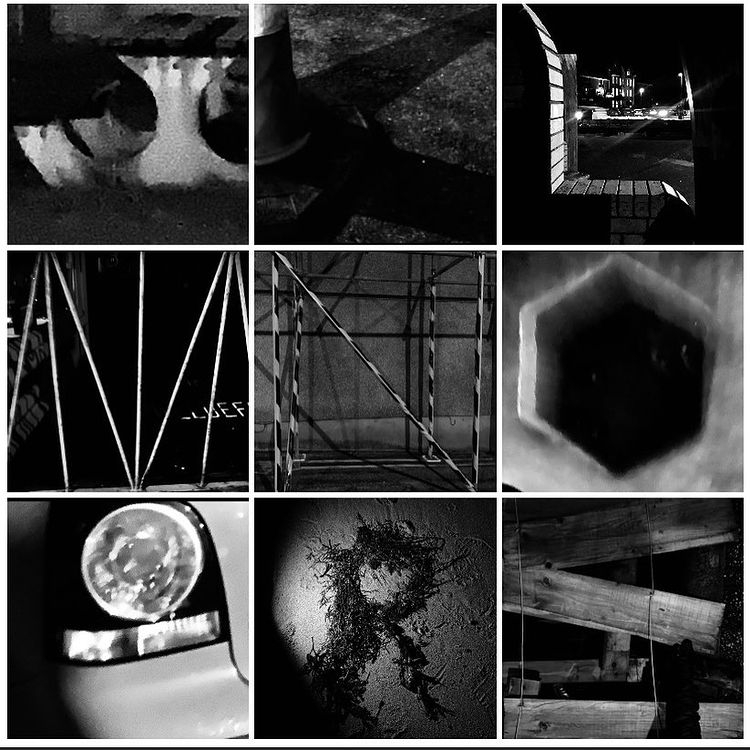
Made from images taken from around Pwllheli. Could not find anything that looked like a Q, to make up for it I got an image of a question mark and quotation marks. Edited the images to be in black and white.
Went out at night even though you cant see as much. The visual restriction and the deep shadows casted by streetlights allowed in theory for stronger contrasts and therefore stronger photography in black and white.
Analysis:
I think They turned out quite well for the most part. They're definitely interesting and a bit gimmicky. If I had to pull some lesson away from this it would be what type of objects look the best in my opinion as letters. I prefer the metal bars, the curves in architecture, a broken fence, some distant lights. Those work well. moody, dark, hazy, alone quiet and desolate. something very liminal. The ones to do with obviously assorted ones such as the sea weed in the R, the question mark and ones which are more commercialistic such as the T in the anchor of a sign. Those miss the feeling. They feel made for the purpose f the image instead of discovered, or like something that was meant to be found and looked at in that way. compare that to the arch in the D. it being flipped on it's side, half obscured in shadow highlighting it's light carved ridges. It feels less like something easy and intended and more like a hidden discovery. A mystery. Intrigue. same with the Flipped horizon lights in the letter "I".
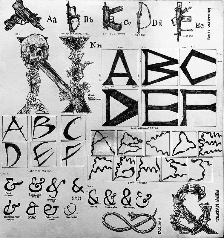
Designed a font called 'Wartorn' out of guns, trying to put in my aesthetic interests.
Additionally a wavy font called 'Seasick'. A font called 'Sharpcyclecell' which was meant to be inspired by sickles and compasses. 'Angular Latin', which was me trying to design a strong looking font that had lots of measurements in it, so it'd look sophisticated and precise.
I also as you can see begin work on 'Trajan Machine' and 'Royal Jeffersonian' which were very high-effort, detailed fonts.
I also design many ampersands on this page and the following page.
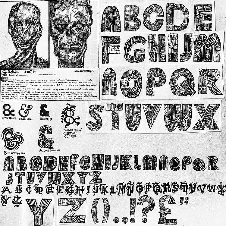
Further development of 'German Copper' and 'Peiriant Bauhaus'.
Final Outcome
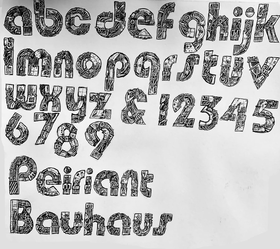
further refinement of the 'Peiriant Bauhaus' Font to it's final iteration.
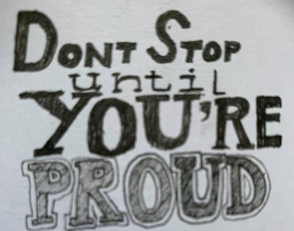
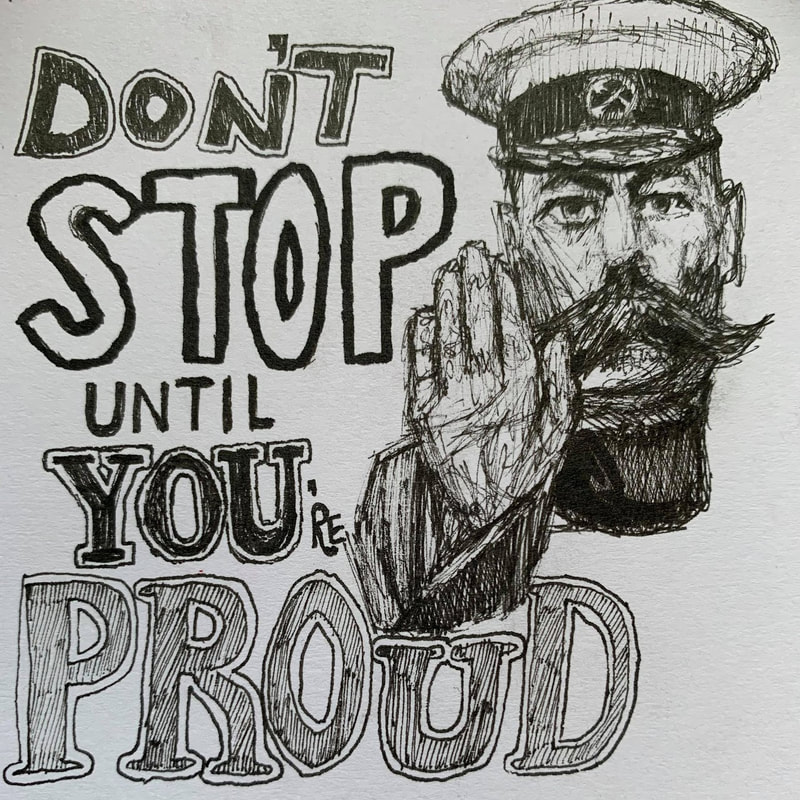
As part of the task warmup we were told to play around with different fonts on a determined list of phrases.
I picked 'Don't Stop until You're Proud' and stayed around in the call to see everyone else's work as extra research. I think the purpose of the exercise was to get us to try to think more creatively about how we can use shape to punctuate a meaning.
I picked 'Don't Stop until You're Proud' and stayed around in the call to see everyone else's work as extra research. I think the purpose of the exercise was to get us to try to think more creatively about how we can use shape to punctuate a meaning.
|
|