10 Gifs
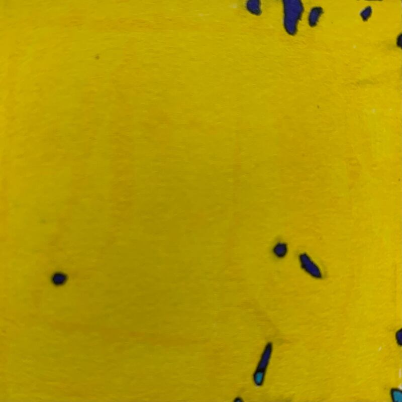
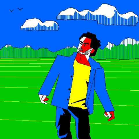
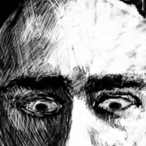
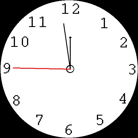
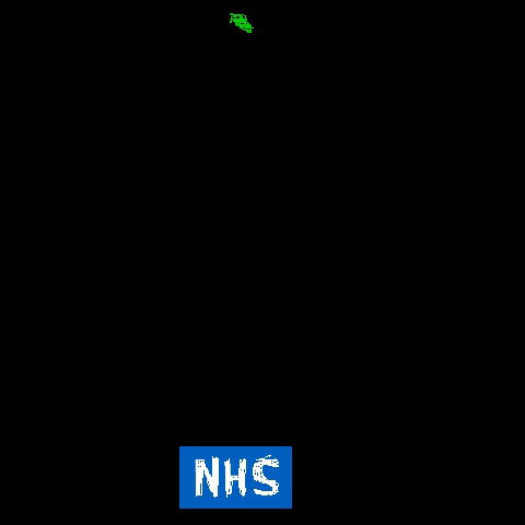
these are my animations, all done in Microsoft paint, half done by mouse, half done via a stylus pen which I borrowed from a student. Microsoft paint is looked down upon a lot amongst people, but it's simple interface make it quick and easy for me to use. I especially like the second animation. The colors are very nice. The limited color pallet of all of them does harmonizes them a great deal when displayed in this way. The colors were a specific shade of red, yellow, blue, green, black and white.
- Procrastination - 2 Frames
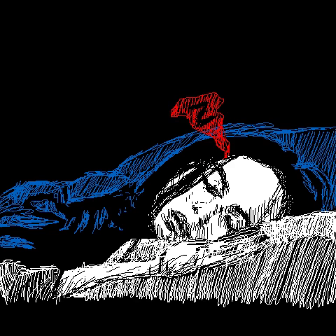
- Sleep - 3 Frames
- Reading - 5 Frames
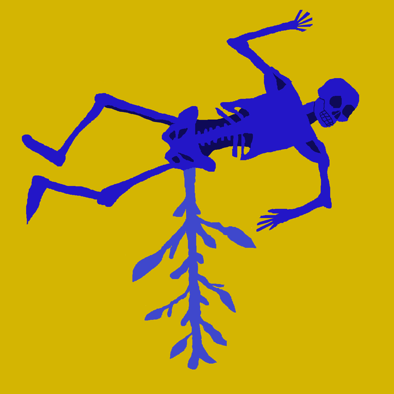
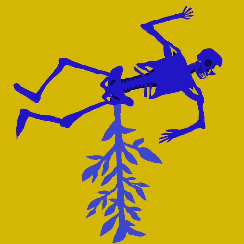
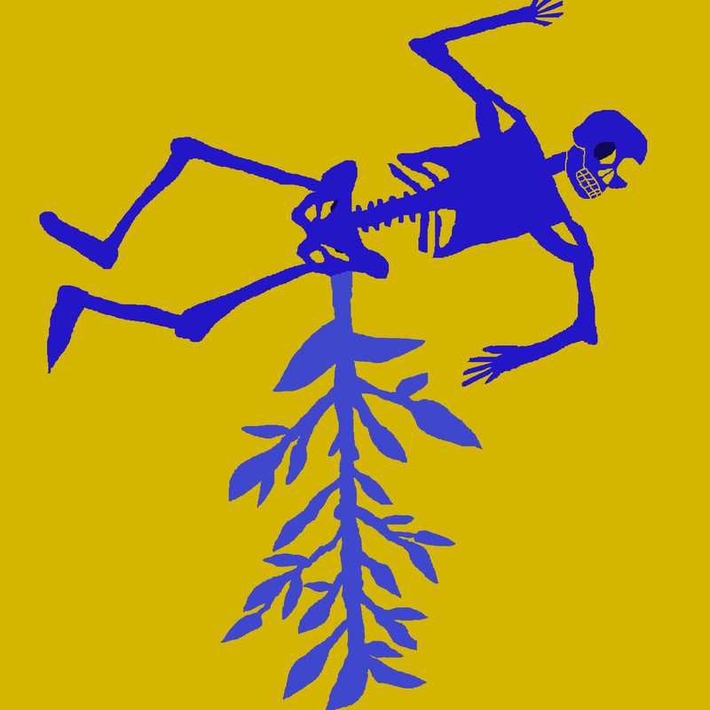
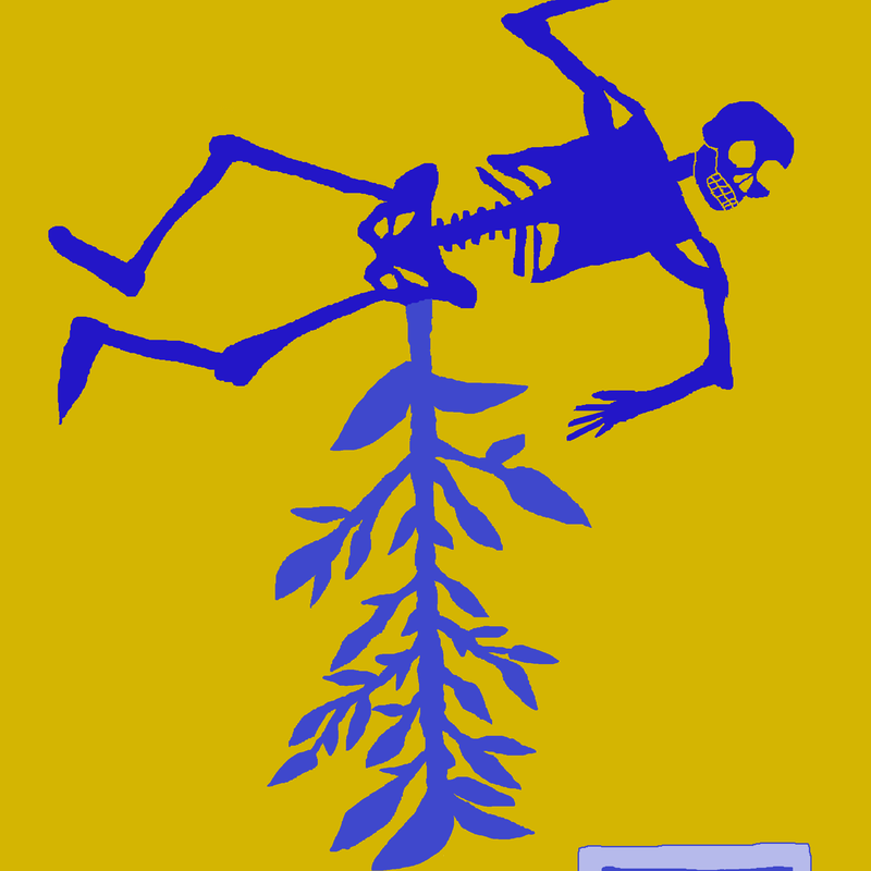
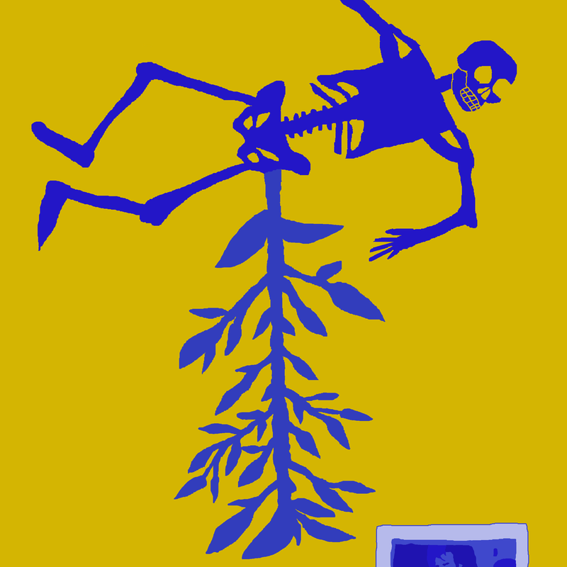
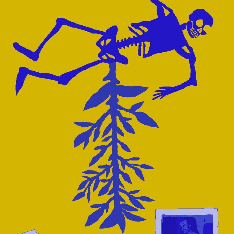
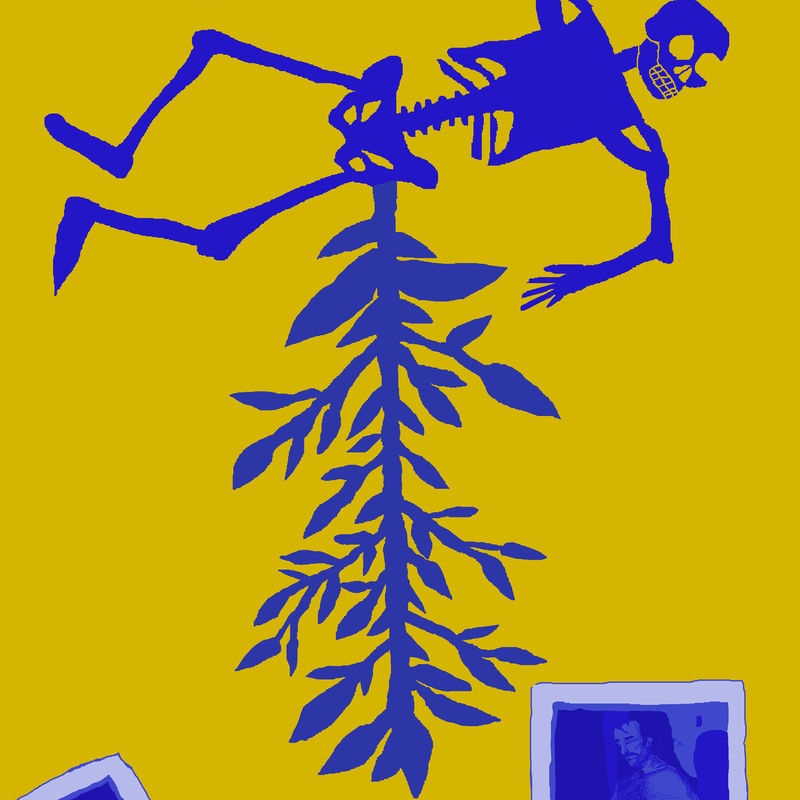
- Mask - 6 Frames
- Communication - 8 Frames
- Chaos - 9 Frames
- Stress - 10 Frames
- Time - 12 Frames
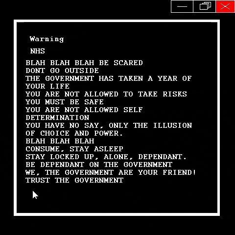
- NHS - 15 Frames
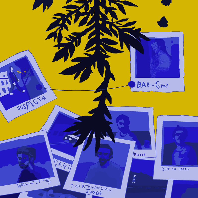
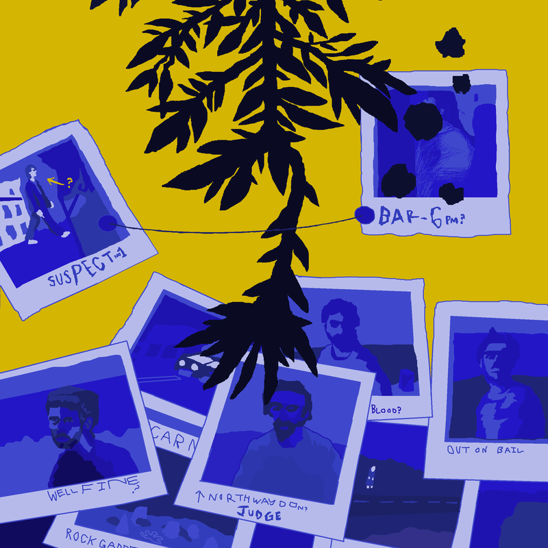
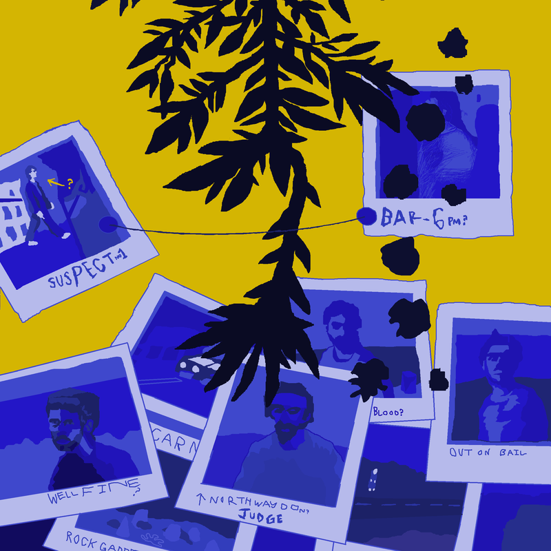
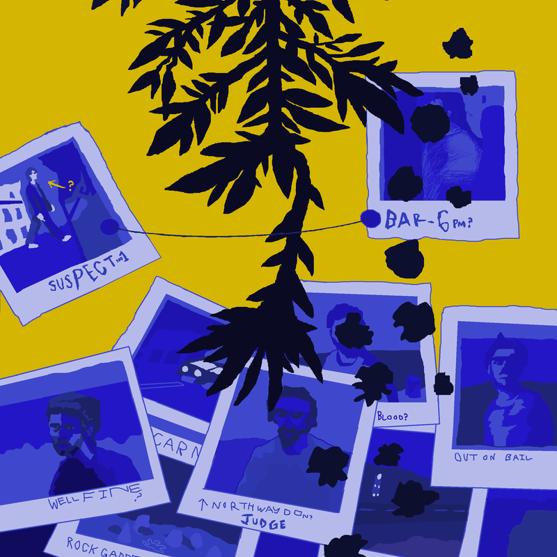
- Plants - 20 Frames

Sources of Inspiration
Scott Pilgrim vs The World (2010)
- Batman (1989)
- Mirai Nikki (2006)
- Gilda (1946)
- Se7en (1995)
- Catch me if you can (2002)
- Casino Royale (2006)
Planning it Out
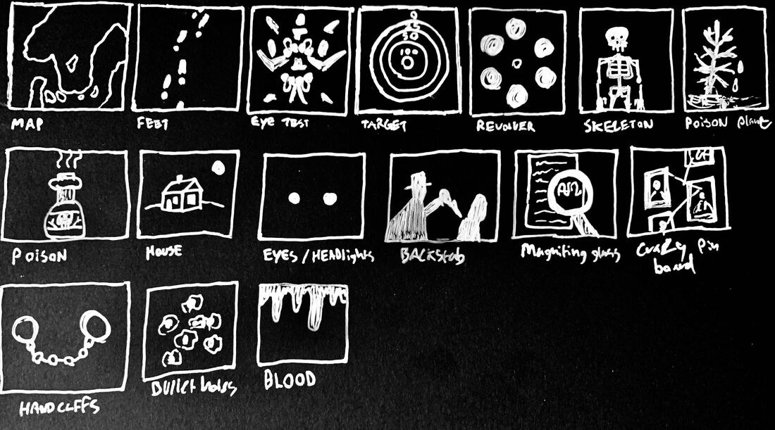
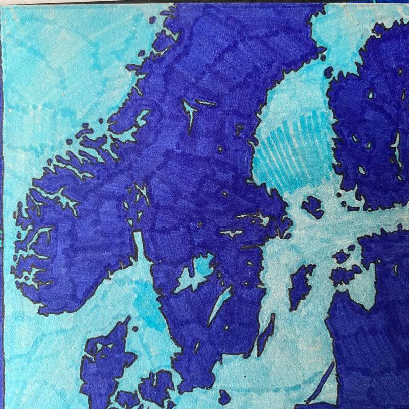
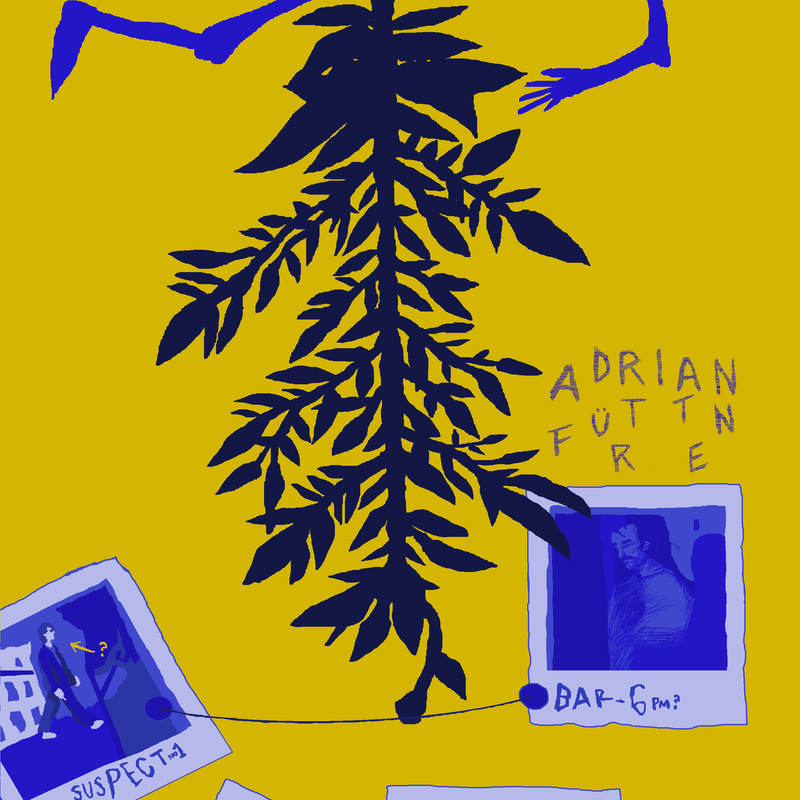
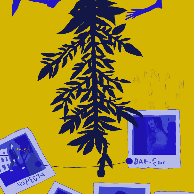
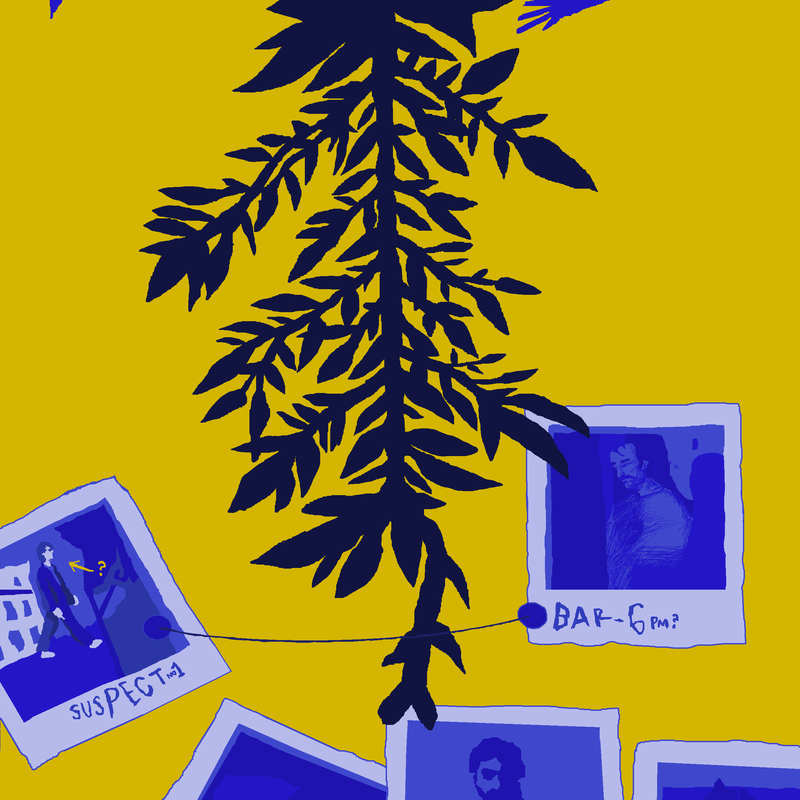
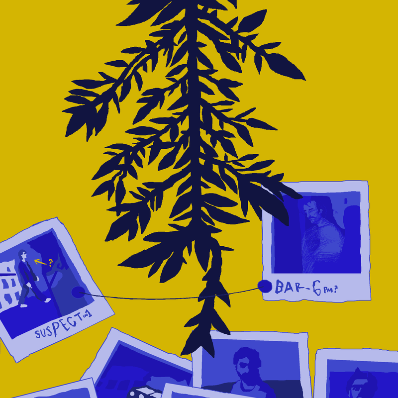
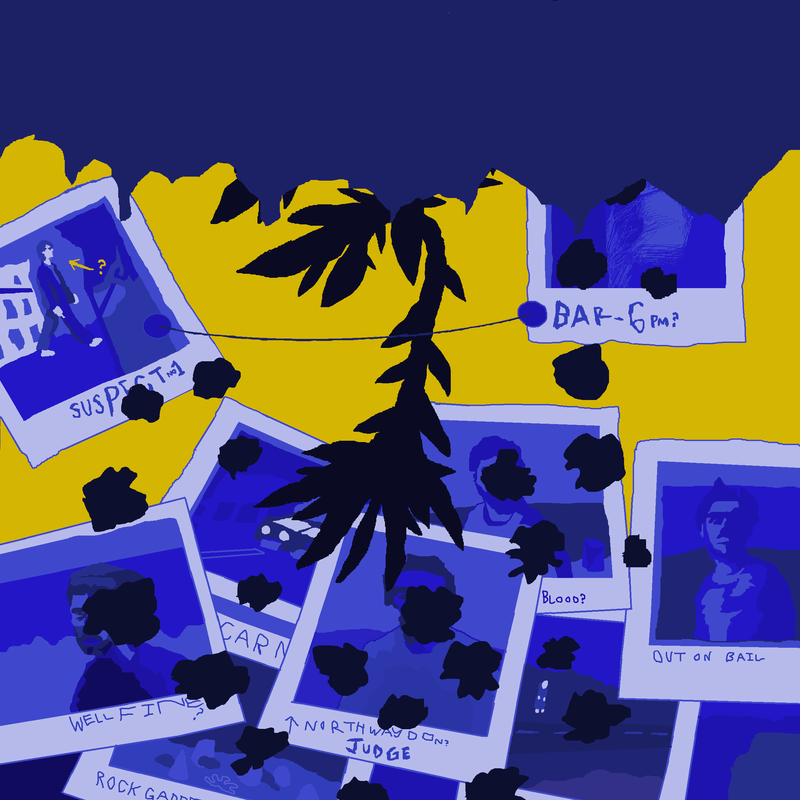
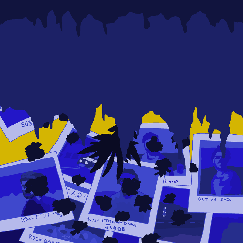
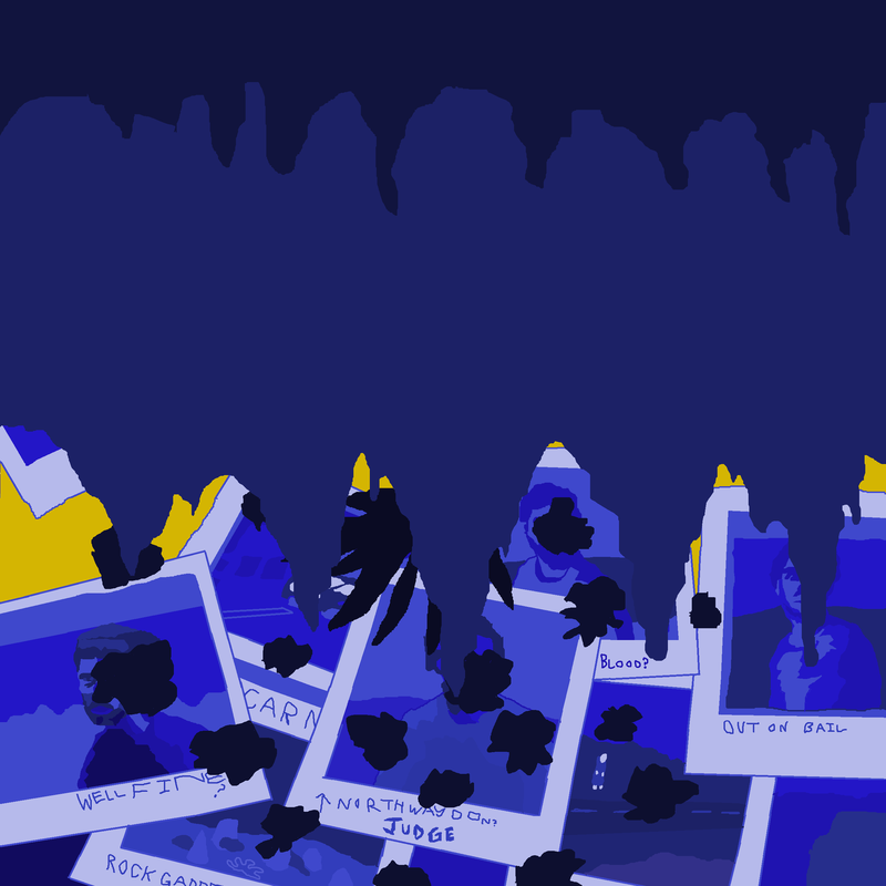
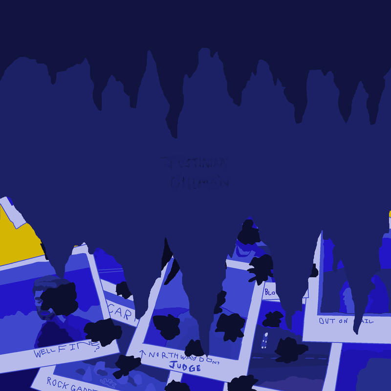
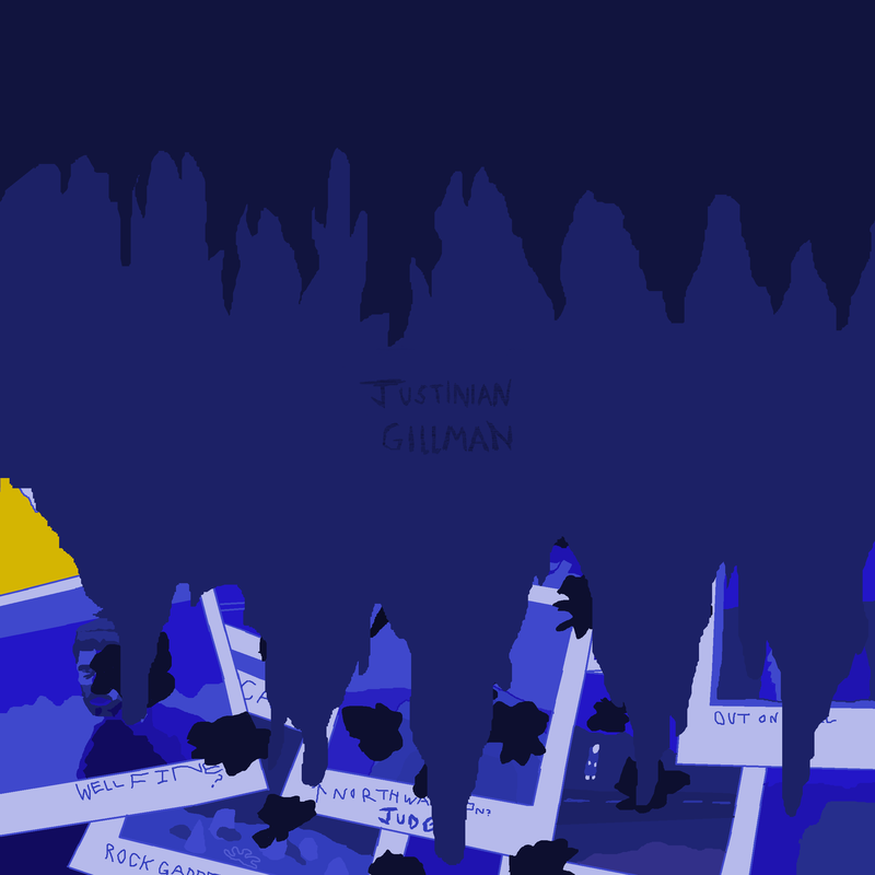
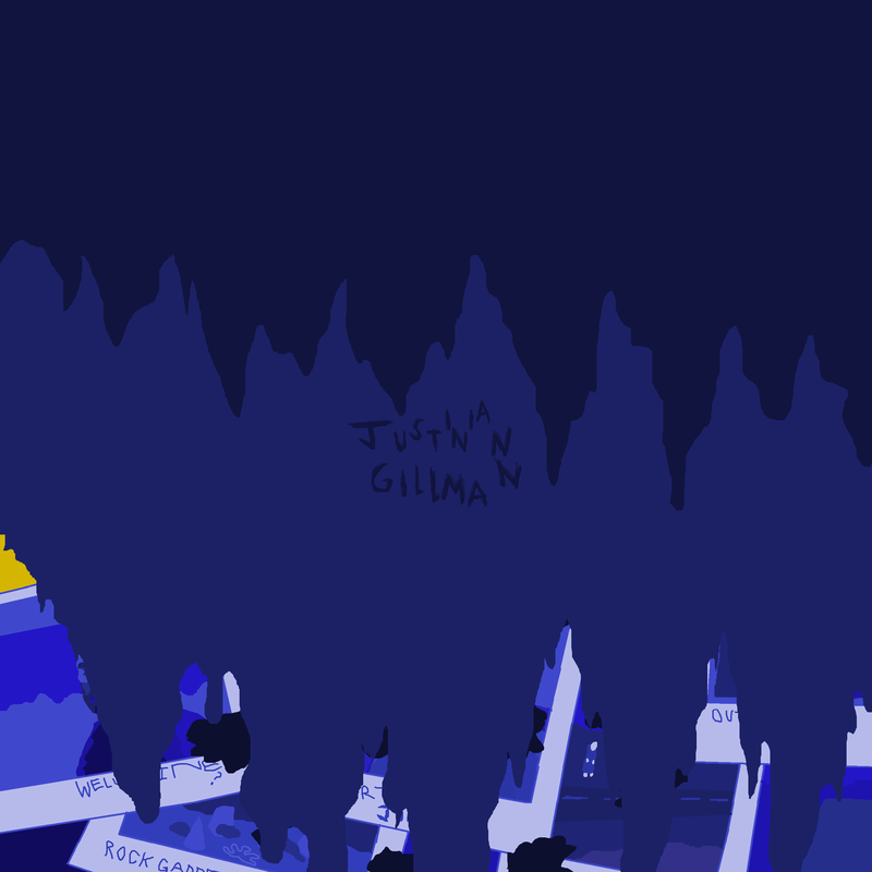
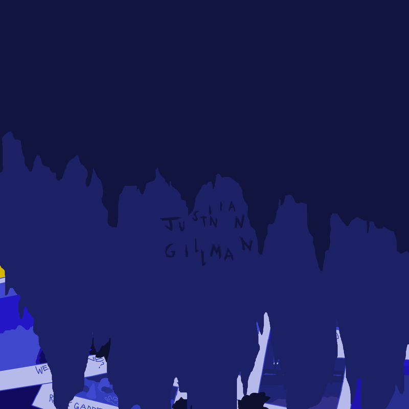
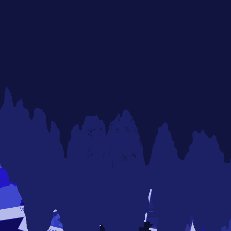
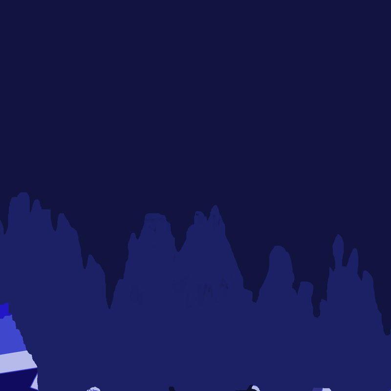
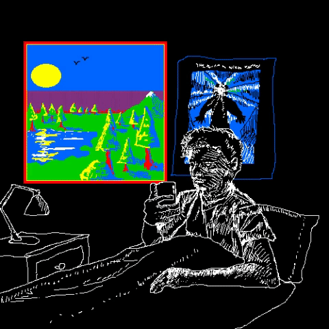
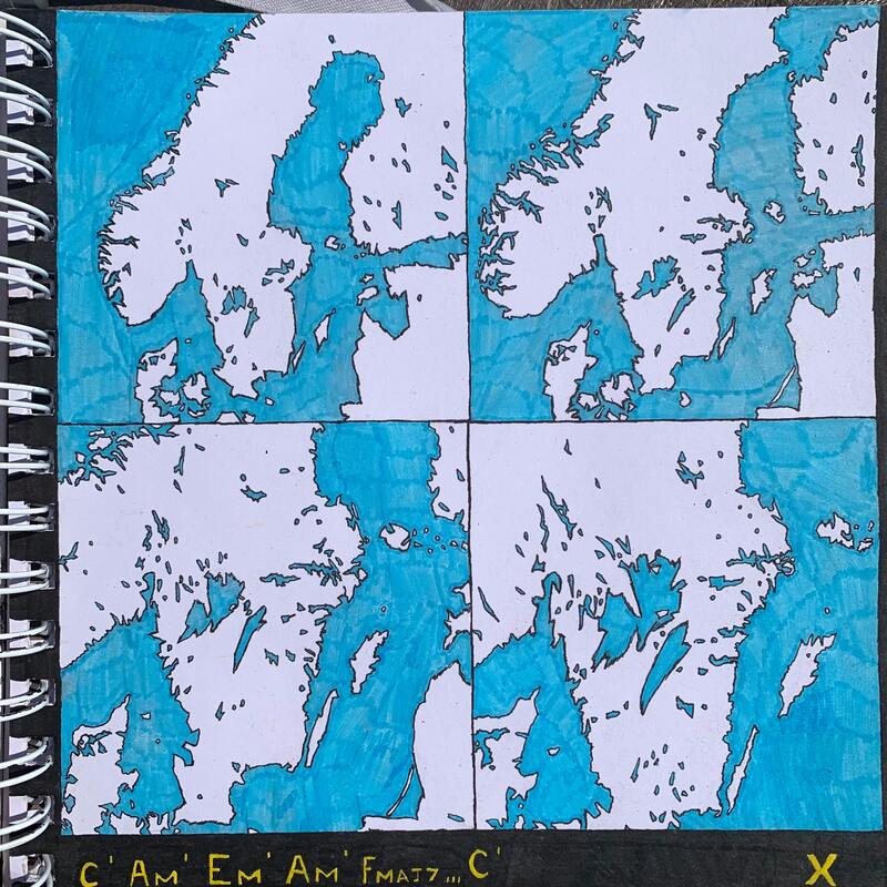
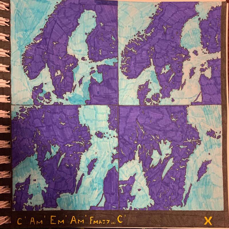
I made little thumbnails on black pieces of black paper and sketched on them with white ink, to encourage slightly darker imagery and ideas. Since I wanted it to look quite moody. I then had the idea to flip some of these ideas around to the opposite colors to create interesting visual contrast. Such as when the map goes to yellow and you see footprints in the snow. that was originally planned to be black and then have white footprints in the snow. But I decided that yellow would be a cool contrast to the blue of the previous few seconds and would be more vibrant and interesting.
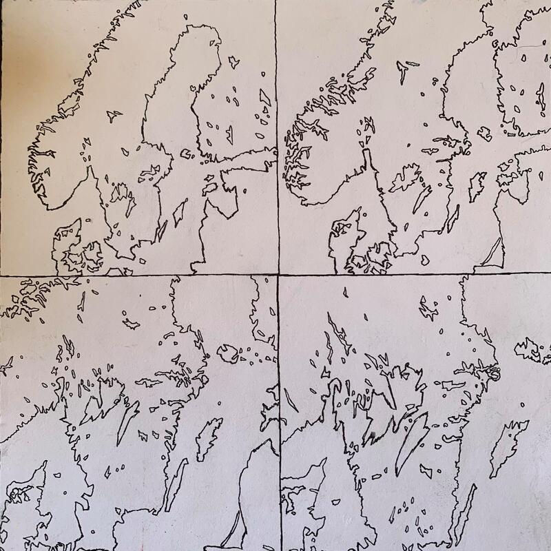
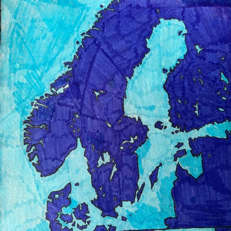
The method for coming up with ideas I had was thumbnailing different visuals for this Title sequences. One idea I particularly liked from the thumbnails was this one of a camera spinning and descending towards Scandinavia as a sort of establishing shot for the rest of the animation. Though these designs took a lot of work they're still rough ideas and prone to change I've considered doing this exact thing on Microsoft paint and seeing if I prefer a more digitized rendition of it. If I think both work successfully I'm half thinking about trying to incorporate both into it.
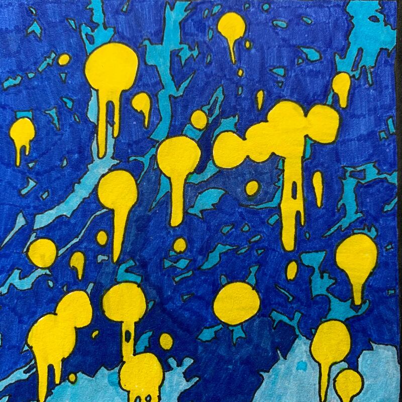
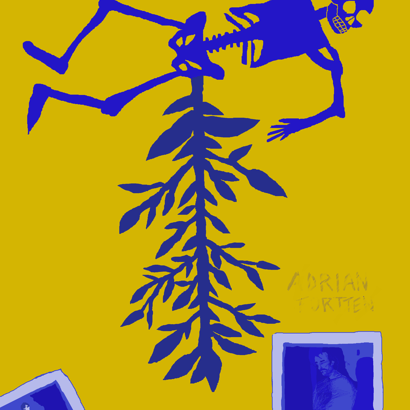
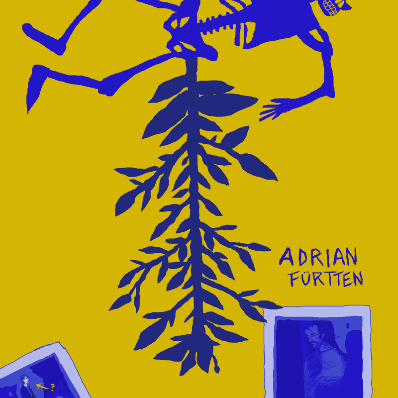
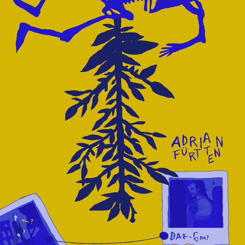
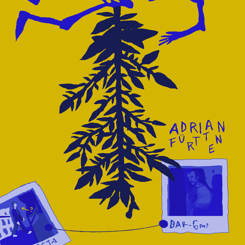
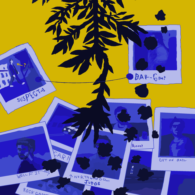
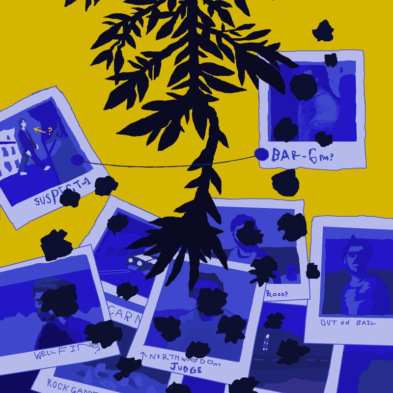
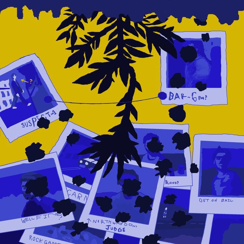
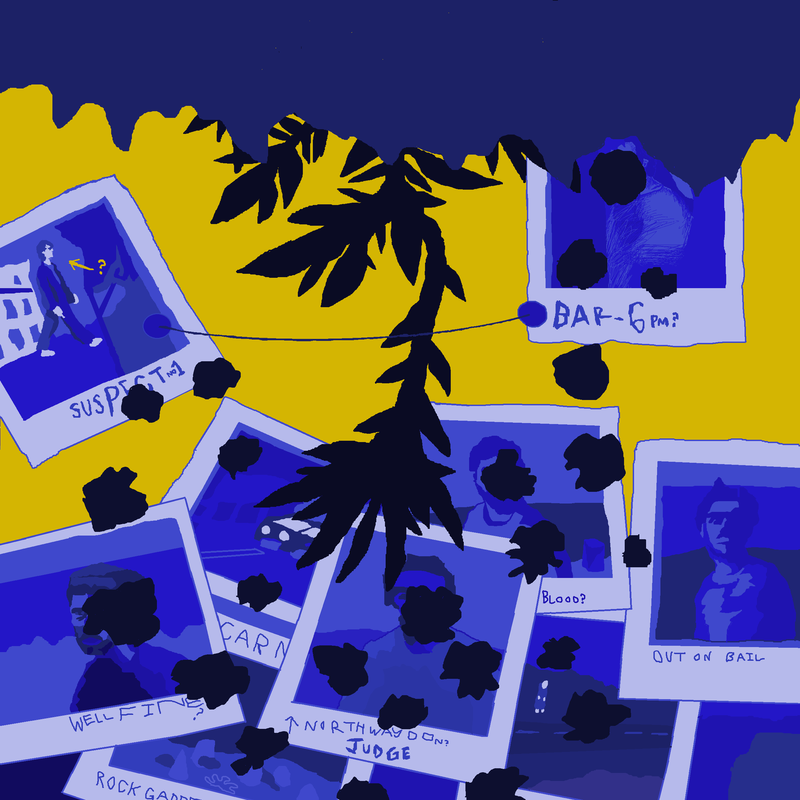
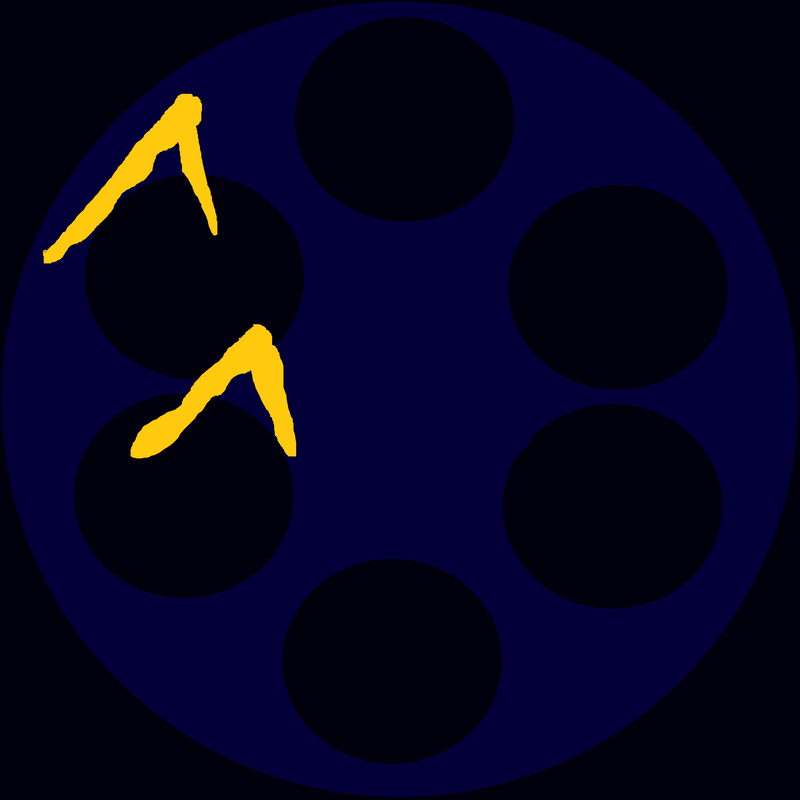
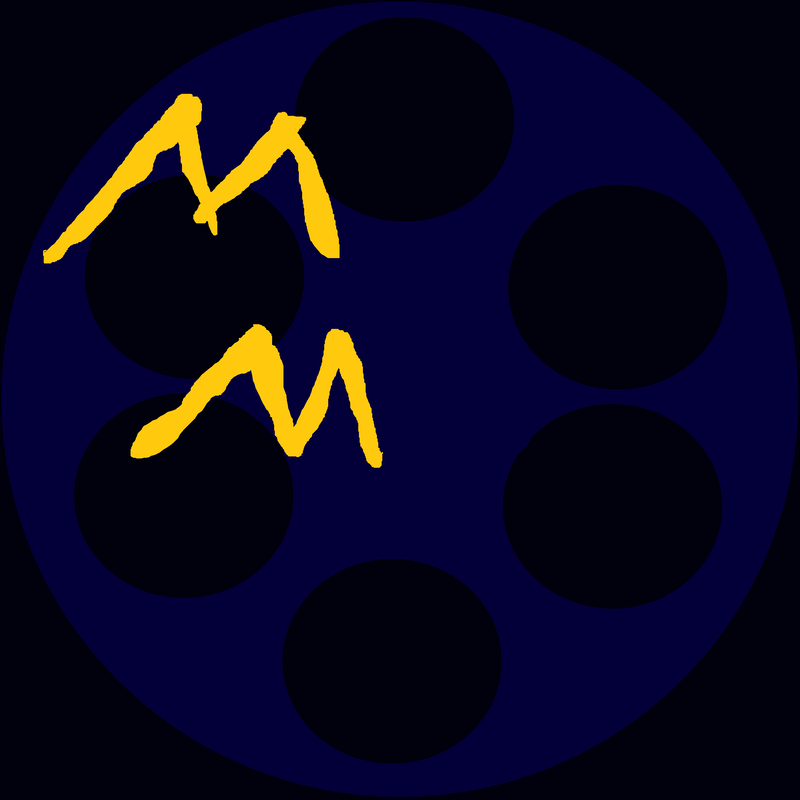
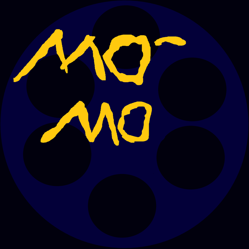
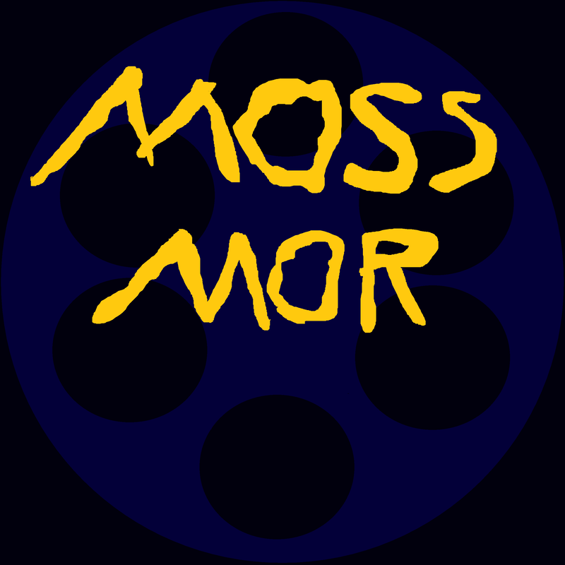
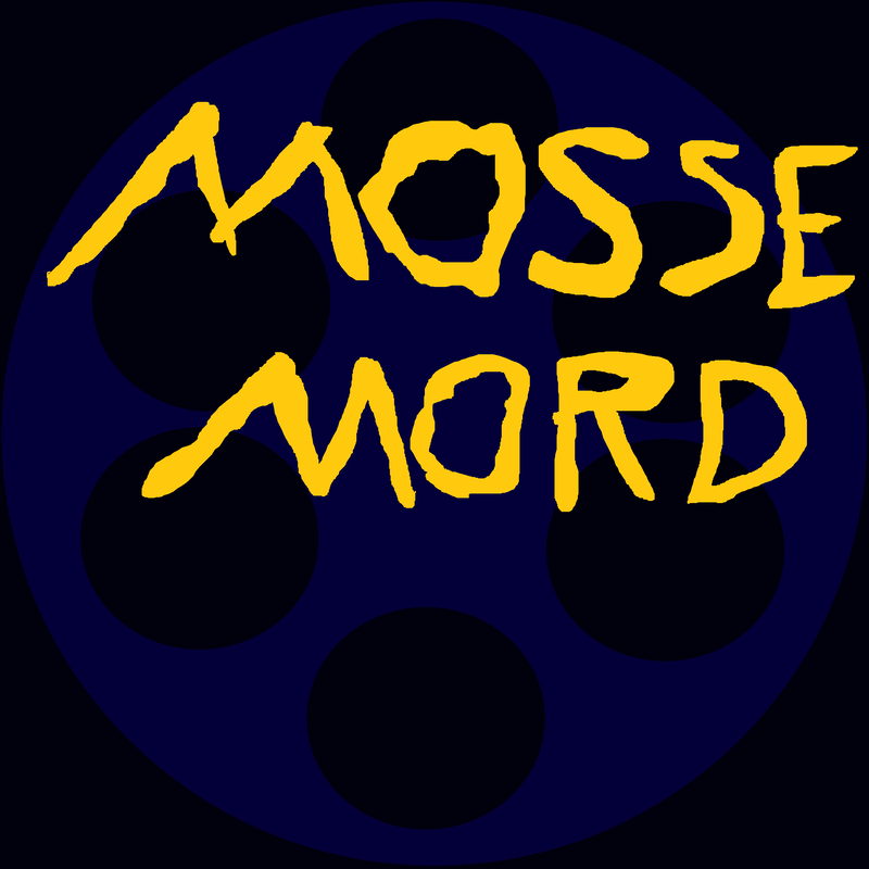
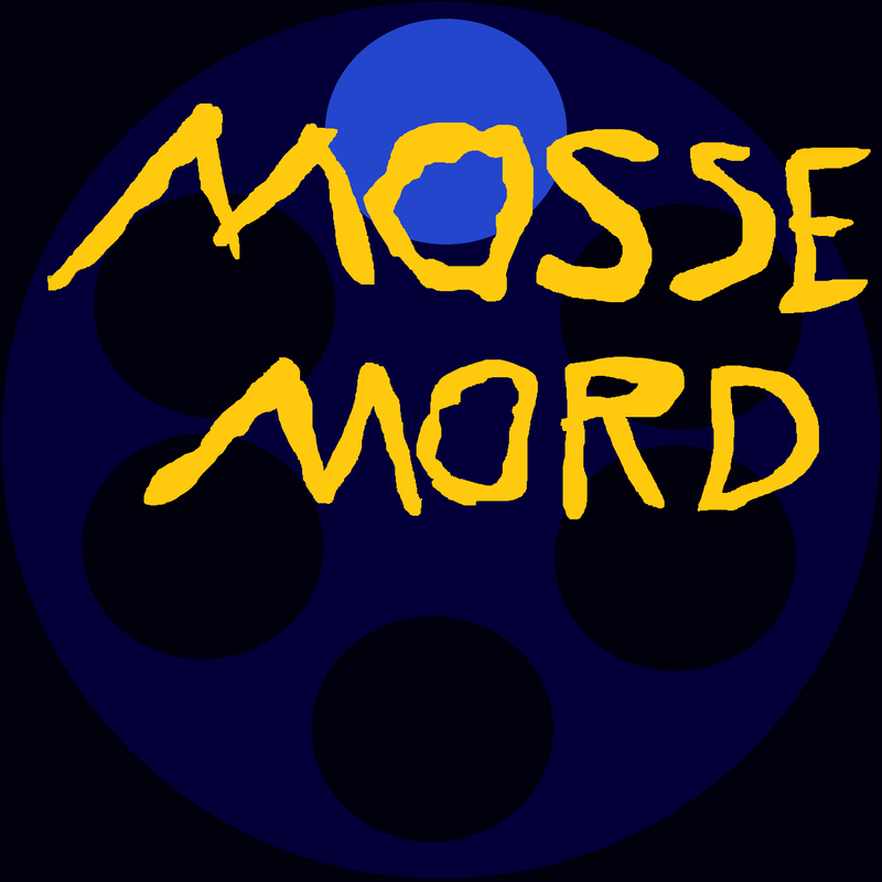
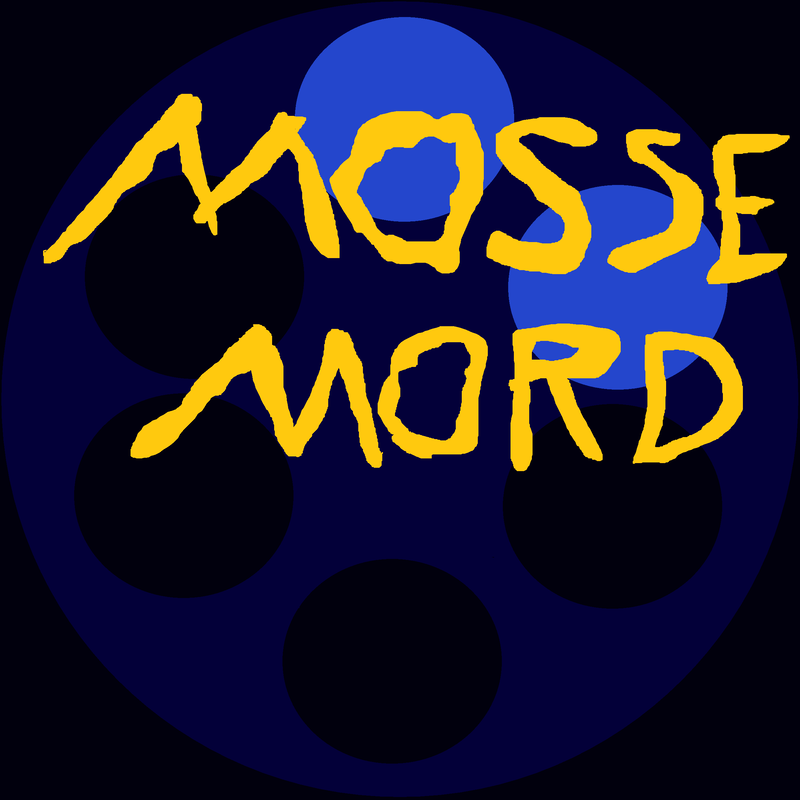
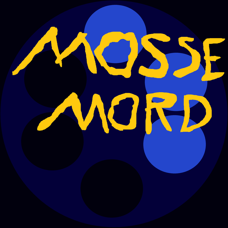
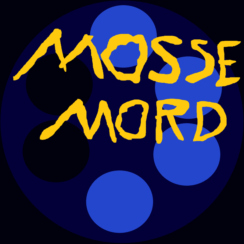
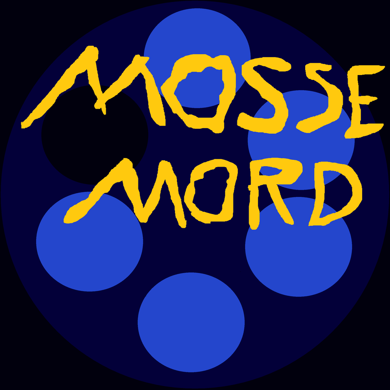
For the writing of the actors and show's name. I'm considering using yellow if I stick with this cool color pallet since I think it'll Stick out nicely. I think there will be some changes done to the pallet as is however due to the blues needing to be darker to fit the darker tone of a Scandinavian detective drama. Meant to conjure up ideas of Film Noire and the cold.
For the writing of the actors and show's name. I'm considering using yellow if I stick with this cool color pallet since I think it'll Stick out nicely. I think there will be some changes done to the pallet as is however due to the blues needing to be darker to fit the darker tone of a Scandinavian detective drama. Meant to conjure up ideas of Film Noire and the cold.
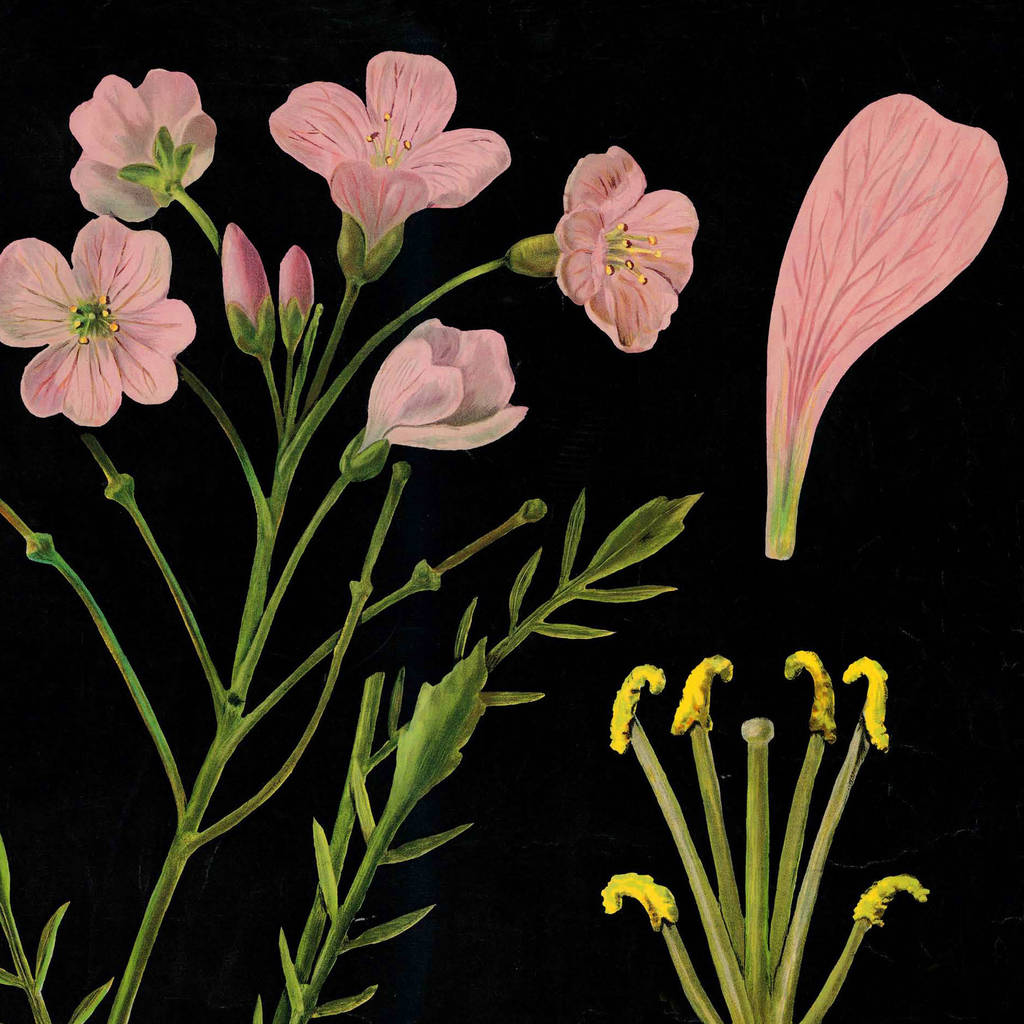
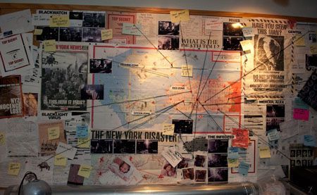

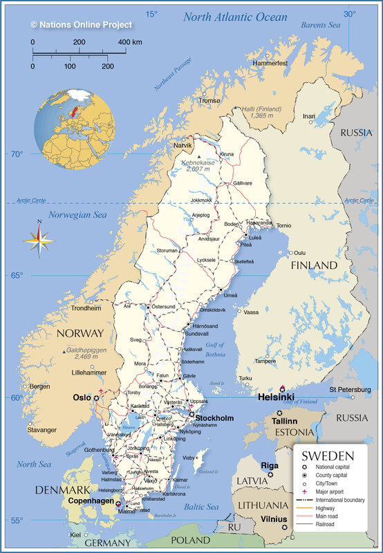

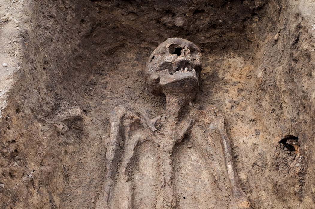
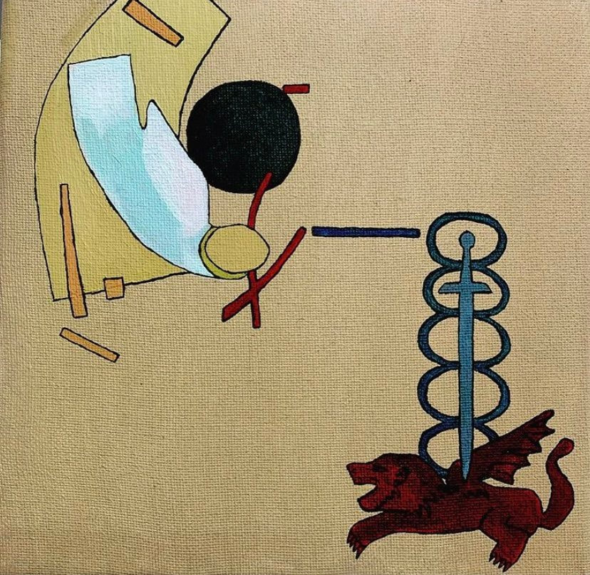
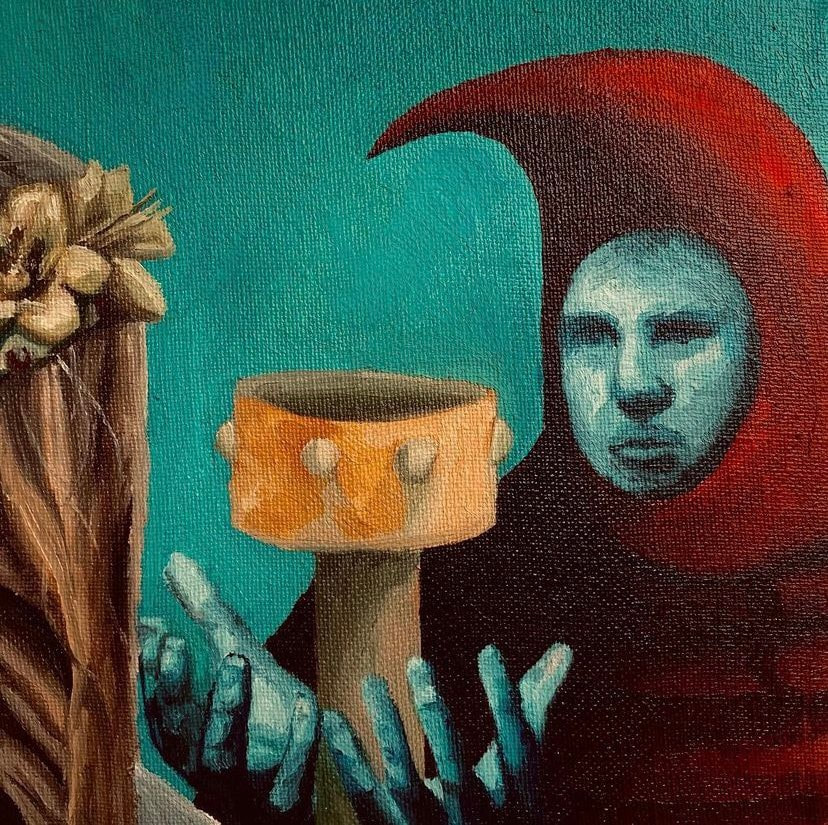
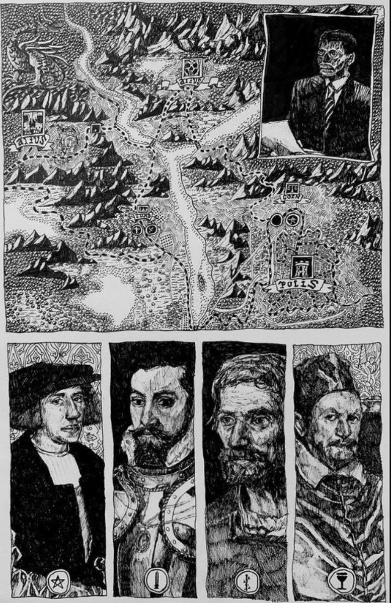
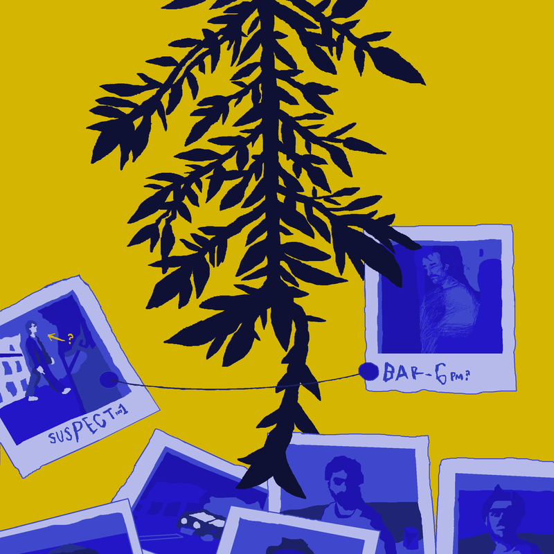
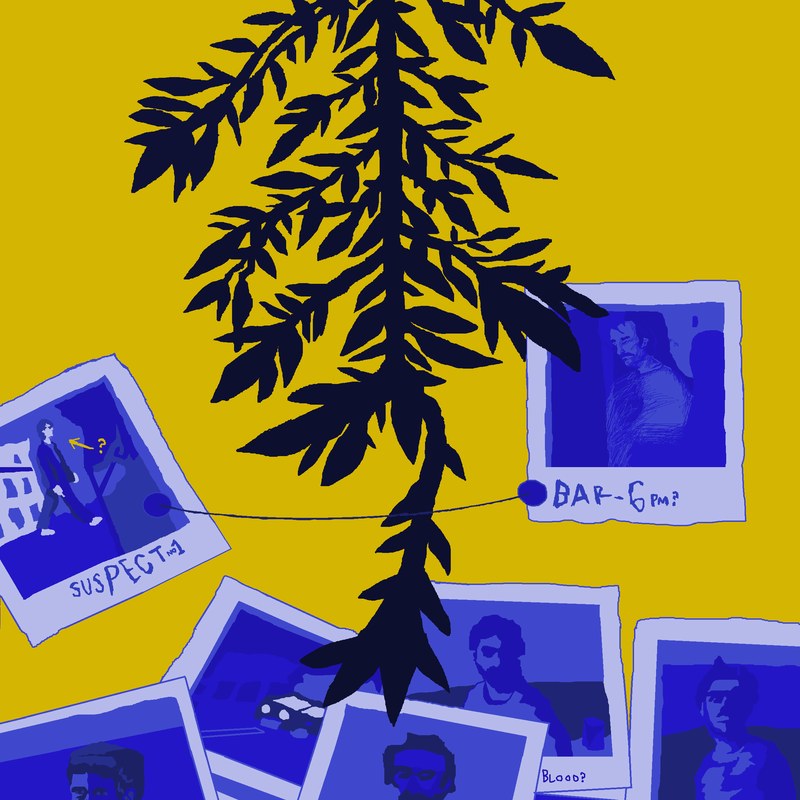
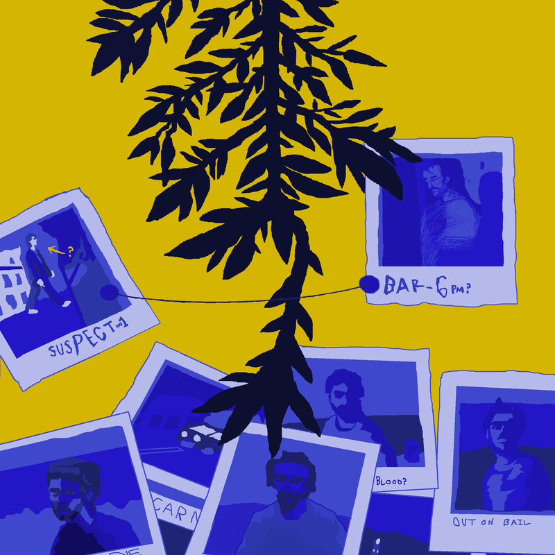
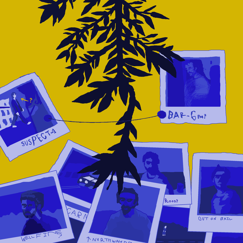
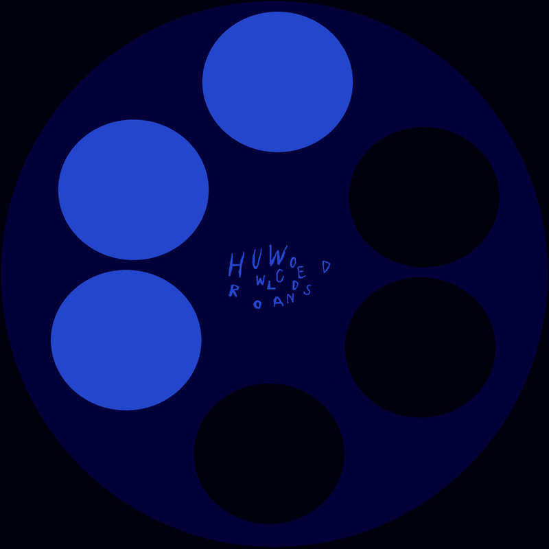
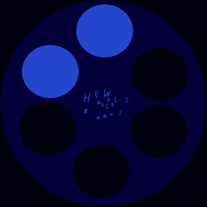
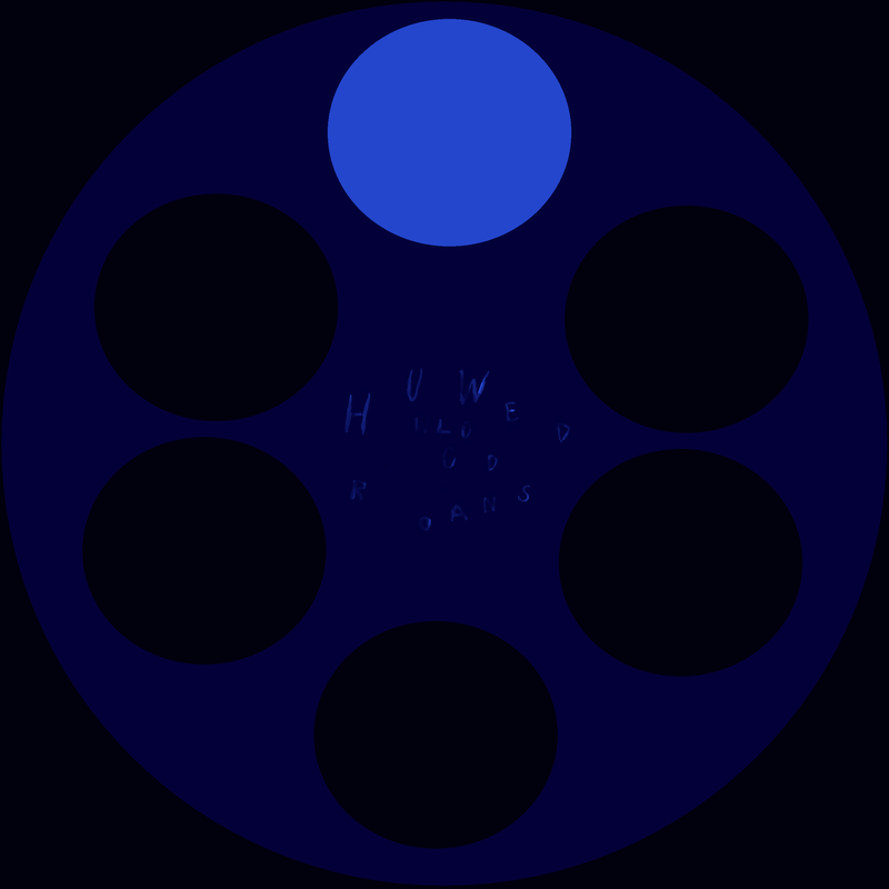
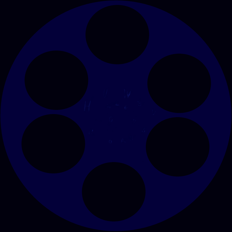
Visual elements were a map of Sweden, Swedish colors, Botanical art, Crime related pin boards, skeletal remains and a revolver's chamber cylinder.
Though these were just the main influencing images at the end point, there were plenty of images which were considered earlier on in the brief.
Though these were just the main influencing images at the end point, there were plenty of images which were considered earlier on in the brief.
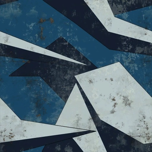
color palate inspiration
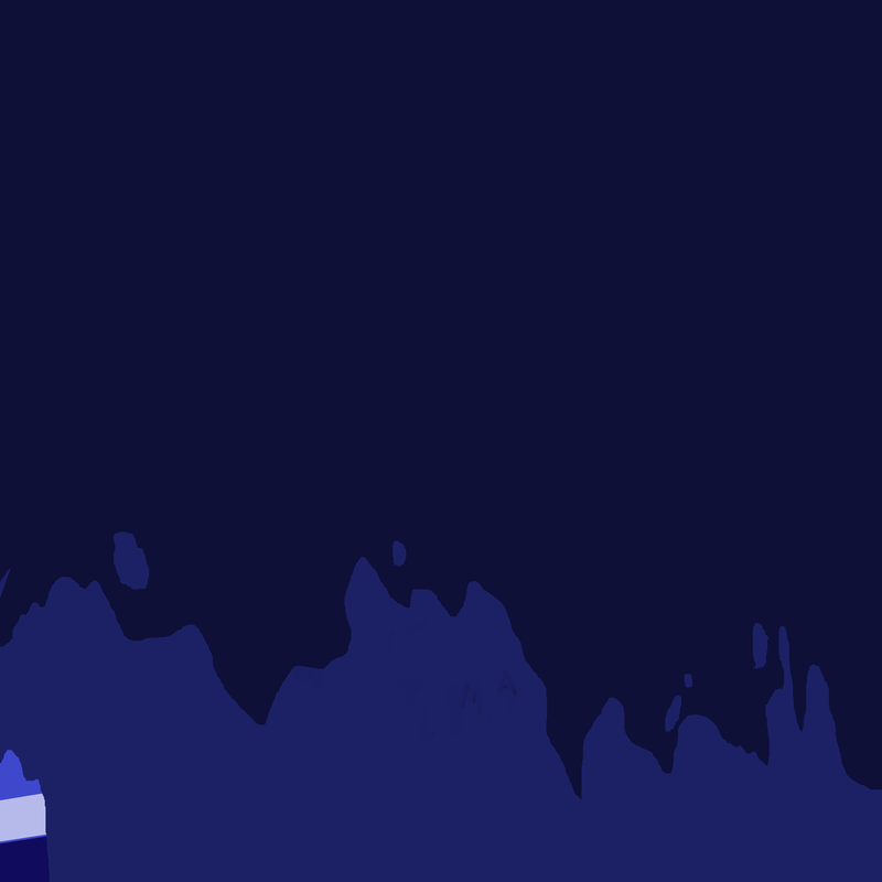
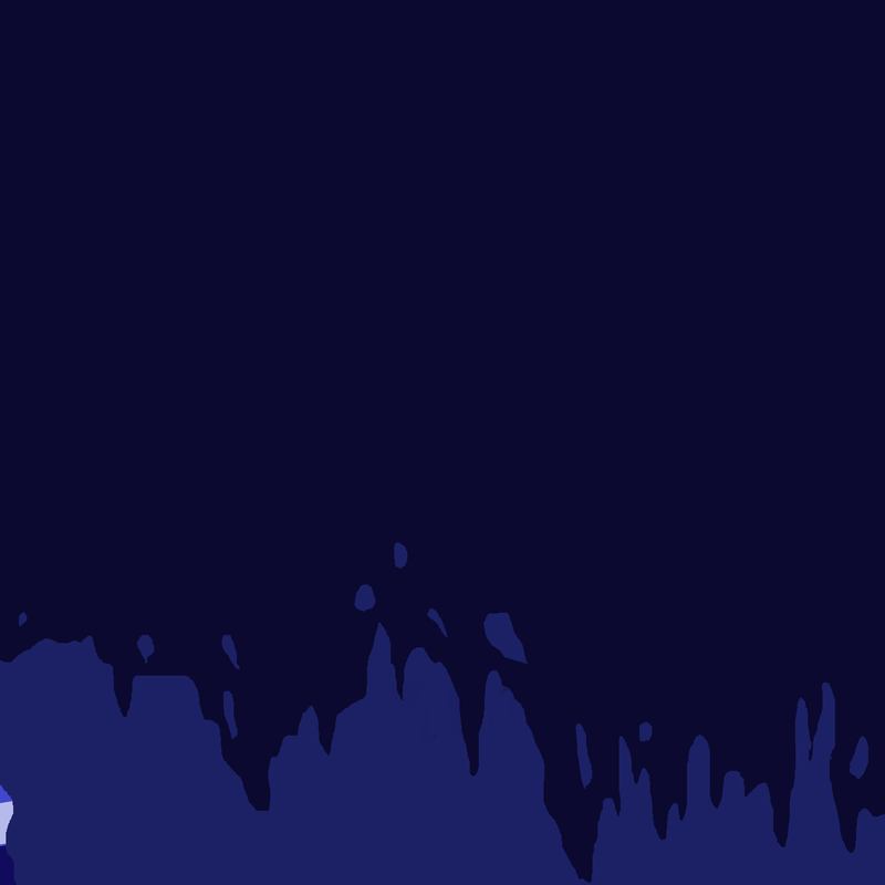
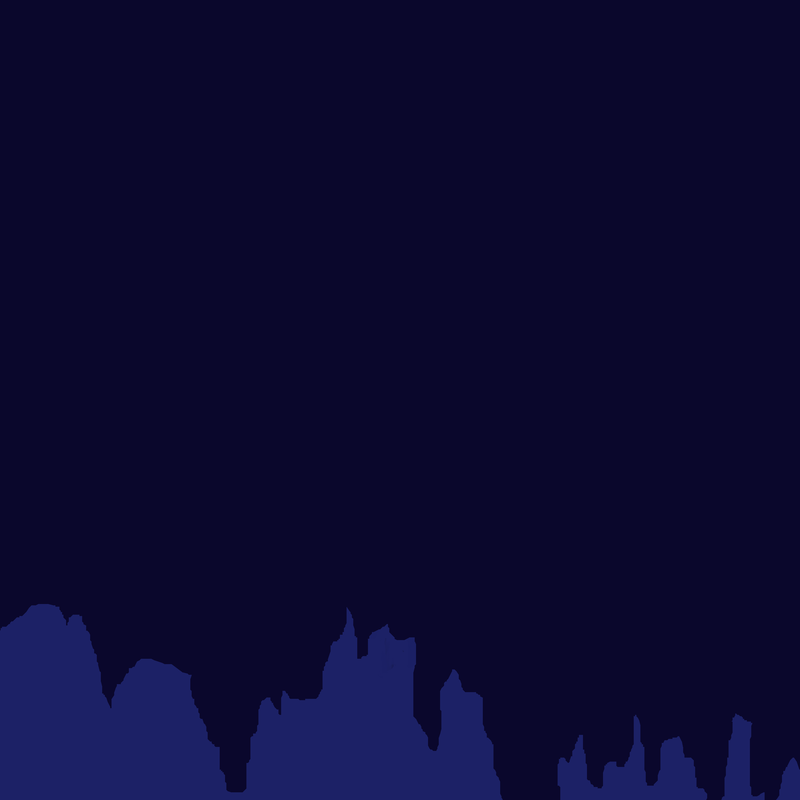
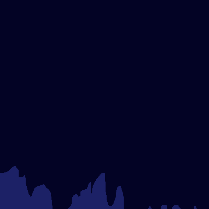
This texture is from a weapon camo in call of duty Ghosts. for some reason this pattern and color combination kept appearing in my head while thinking about this task. I think my brain likes the sharp shapes and subdued blue tones. Puts across the feeling of the sharpness of cold. An idea I could use to my advantage. This being an intro to Scandinavian Detective production, I've considered ideas like knives and other such objects which would pair the meta-aesthetics of pattern